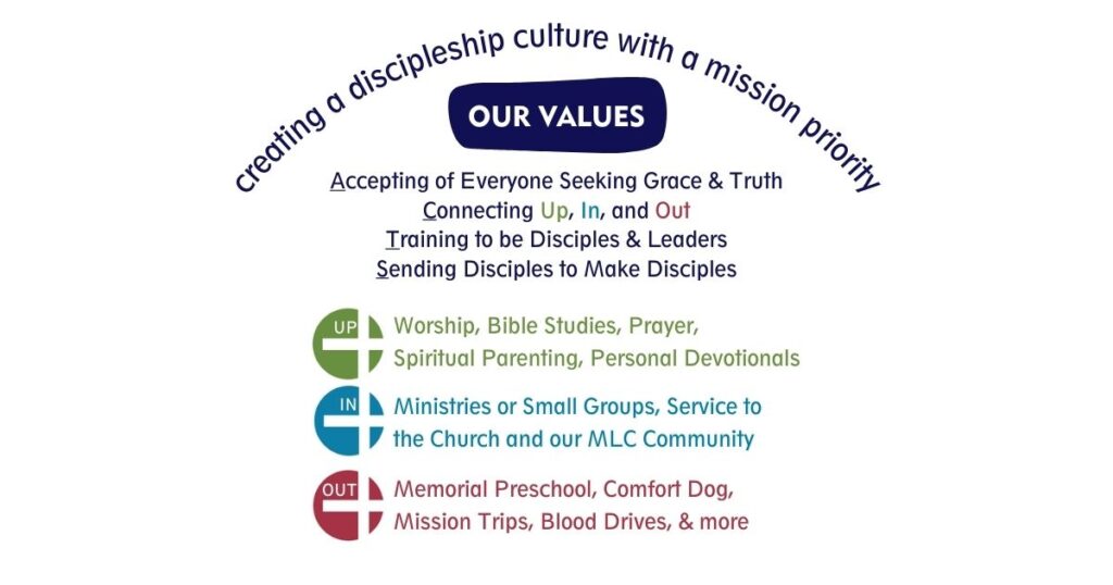
The font choices are fun and bold, and not overly corporate while maintaining clear readability. The color choice was selected to be vibrant and to be largely compatible with our current décor. The cross is at the center of the three circles reminding us that Jesus is at the center of our relationships up, in, and out. This concept comes from our values statement: “We strive to connect and deepen our relationships Up, In, and Out.”
This logo was officially released on August 29th, 2021.
